

Design Considered #11
Refining Parisian extravagance, rules on painting with purpose and a list of outdoor essentials.

#01 - Opening Thought
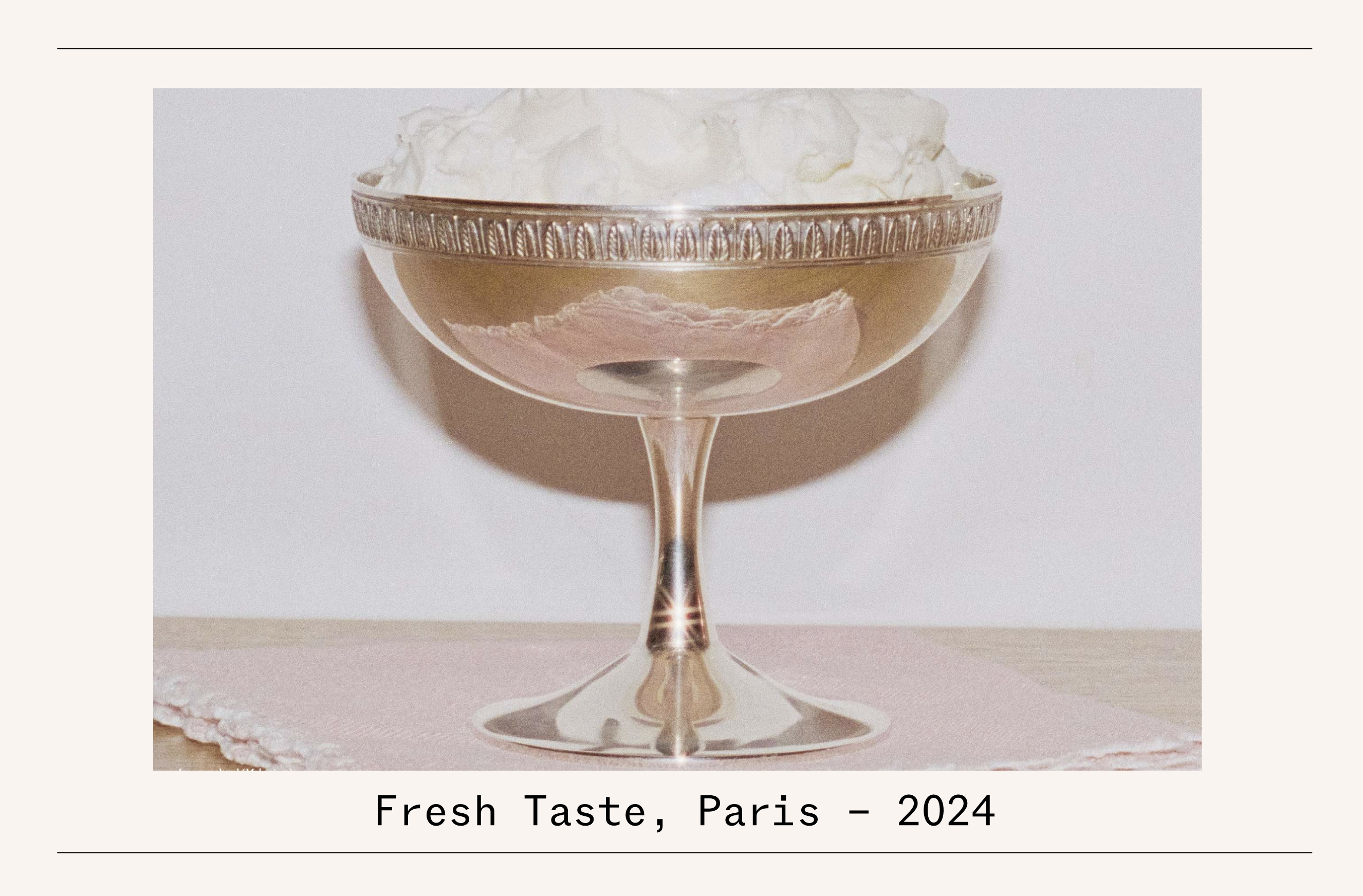
Nothing excites me more in branding than when a storied name lets modern creative talent re-interpret its design universe. With photography from James Nelson and art direction from Olivier Leone of Pragma, the upcoming ‘I love Paris’ campaign from Christofle (the luxury French silverware company founded in 1830) takes a cheeky and whimsical approach to spotlighting its fine wares. Through a series of portrait-led stories, the campaign, launching September 1st, showcases the playful integration of its precious pieces into the daily lives of modern Parisians. The above photo shows a sorbet served up in a silver-plated bowl inspired by Napoleon Bonaparte and Empress Josephine’s residence in the French home of drinks entrepreneur Melanie Masari.
#02 - The Pleasure of Paint

The saying might be ‘as boring as watching paint dry,’ but it’s incredible what a good lick of the stuff can do. Earlier this week, dumped by a delayed Eurostar train in Brussels with no hope of getting home to London at midnight, I was forced to find a hotel at late notice. Stepping into the city’s new Hoxton’s perfectly lit lobby, instant ease from the day’s drama was felt simply via the tasteful tones of paint the well-furnished space’s walls were adorned with.
“It’s called colour psychology; there’s a science around how colour affects our emotions and memories,” explains Anne Grønskov, who launched the brilliant Danish paint brand Blēo this year, intending to disrupt a largely staid industry. “We want Bleo to become an institution for colour, where people can learn why a certain yellow might suit one room, and a darker blue or a red is more fitting for another room.” To do so, Grønskov has enlisted an inspiring cast of collaborators in the form of designers who deeply respect the role of colour in their work. Names include Belgium’s Muller Van Severen, Britain’s Barber & Osgerby, legendary architects like David Chipperfield, and top Danish fashion designer Cecilie Bahnsen.
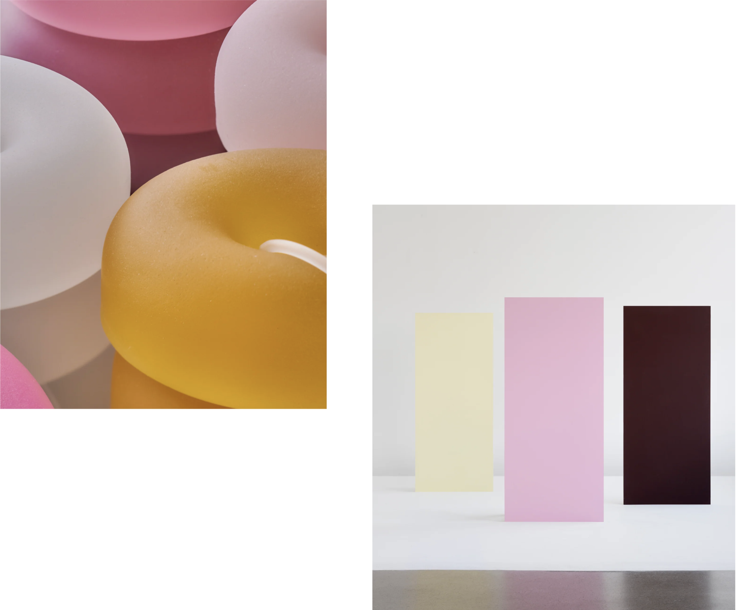
“I asked designers to think about what their colour palette was,” says Grønskov. “For example, Sabine Marcelis (inspiration imagery and Blēo shades below) returned to me with 50 colours. As we developed the paints, we refined the number down, really thinking about which colours people would live with in a room while truly being a part of her design universe.”
With the paints available in well designed boxes that offer an easy-pour option (like a wine cask) the brand is also trying to promote the idea that experimenting with colour in the places that we live shouldn’t be a chore. This makes more sense today than in years past as people now tend to live in smaller (easier to paint!) apartments in urban centres. “My dream is to have shops where having people come in, buy 10 litres of paint, bicycle home with it and paint their house in two days,” she explains.
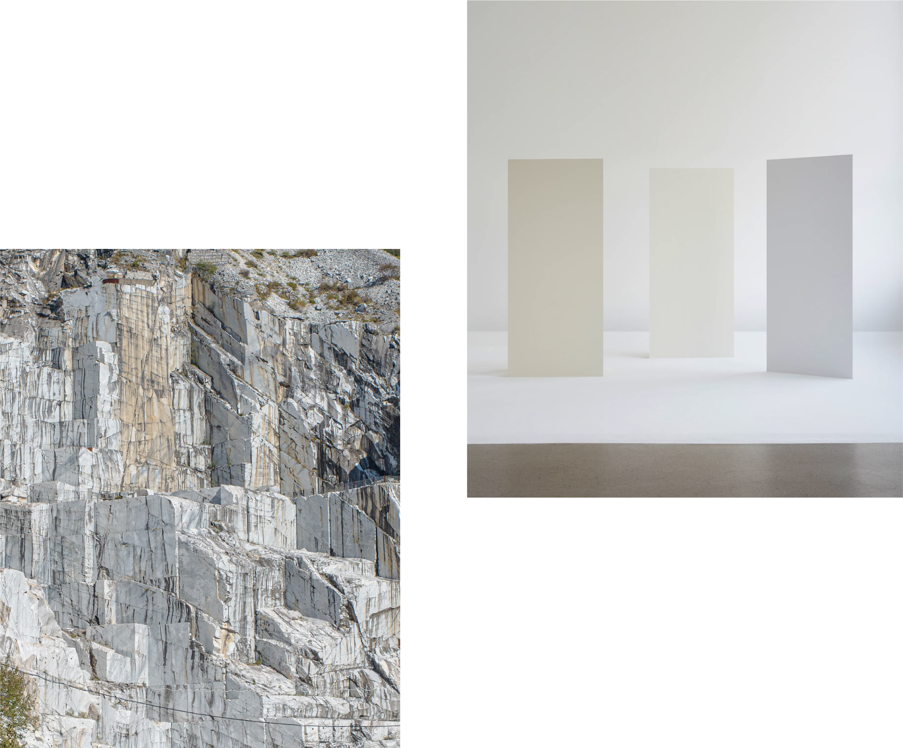
Guided by the tastes of top designers, Blēo eschews ‘bad’ customer colour choices through a curated line-up of shades from people whose daily practice revolves around making uplifting spaces. Still, when you have master minimalist John Pawson (inspiration imagery and Blēo shades above) offering 13 different shades of white through Blēo (a 14th is in the works), choosing what’s perfect for your own place can still seem daunting. But Grønskov encourages us not to overthink it - it is just paint, after all. “If you’re true to yourself and your taste, little can go wrong,” she says. “You’ve likely bought furniture and designed your own spaces based on your style - so you should be able to be confident when choosing a wall colour too.”
#03 - Design Selection
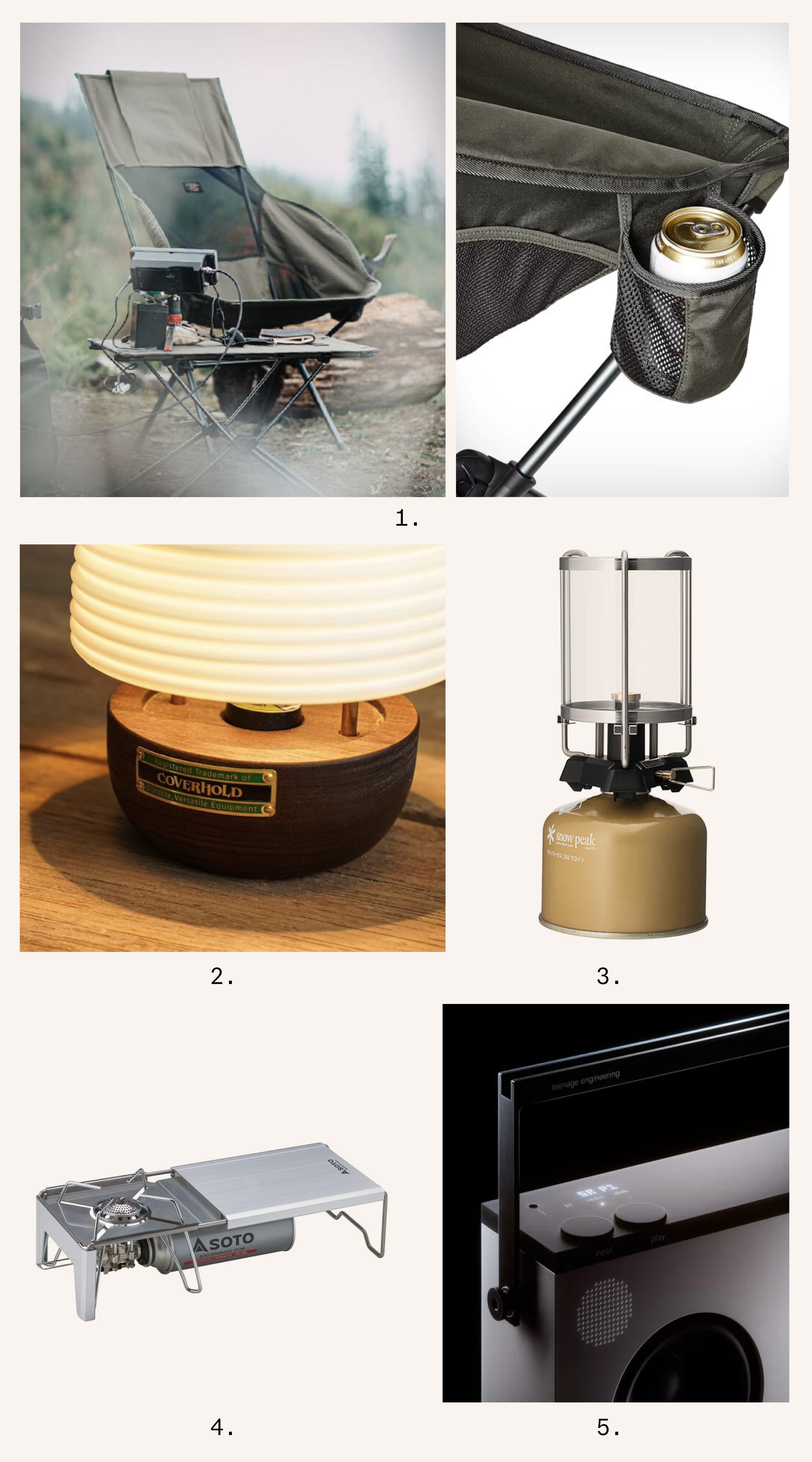
To say I’ve slept in a tent once in the last ten years would be a lie. However, my interest has spiked as I’ve observed the rapid popularity growth (particularly in the outdoors-obsessed Japanese market) of Korea’s Helinox and the interesting design collaborations the camping company is doing. Its (1) Filson x Helinox Savanna Chair is a sturdy, and surprisingly sleek, packable number with a built-in beer holder for an after-hike cold one. Staying in Korea, this (2) Bee Hive Lantern Stand from Cover Hold, which encases a solar chargeable lamp from Goal Zero, is good for both the planet and late-night mood setting.
Just like setting up a tent, building a fire would be well beyond my outdoorsman abilities, especially after a couple of beers. Thankfully, this (2) Nyx gas-powered tabletop lantern from Japan’s Snow Peak can easily create a cosy flickering flame. For cooking, the aptly named (4) Minimalist worktop, with a connected stove, from Japan’s Soto is well-suited for a tasteful fry-up. Accompanying tunes on a screen-free setup - in the highest audio quality, of course - can be enjoyed through the streamlined FM Radio & Bluetooth ready (5) OB-4 from Sweden’s Teenage Engineering. Now, it seems, I’m ready for a night with nature.
#04 - For Your Consideration

Danes care about architecture—this is a good thing. Just this week, Denmark’s prime minister chose to meet regional leaders at Alvar Aalto’s stunning Kunsten museum in Aalborg. It is worth a visit. In the capital, Arne Jacobsen’s 1960 modernist, minimalist SAS Royal Hotel has just been granted preserved status.
Preservation of our planet remains at the top of mind for Daan Roosegaarde, the visionary behind Studio Roosegaarde’s Smog Free Tower concept, the most recent iteration erected in Abu Dhabi. He recently sat down with BBC’s The Documentary Podcast to discuss it. The show also just profiled the architect Daniel Libeskind in brilliant fashion.
From saving the world to saving ourselves, the Musubi Academy provides ‘Japanese wisdom for contemporary life’ regularly featuring inspiring and uplifting articles and essays on architecture and craft.
A few weeks back, I chatted football kit design with Munich’s Mirko Borsche, who wasn’t quite ready to reveal his studio’s design of Bundesliga giants Bayern Munich’s Champions League jerseys. They're out now and are very nice.
Finally, in what is becoming a regular feature (of places I’d like to buy but can’t afford), one unit remains for sale in this Swiss concrete brutalist beauty of a building by Basel’s Buchner Bründler Architekten.
#05 - Through The Lens
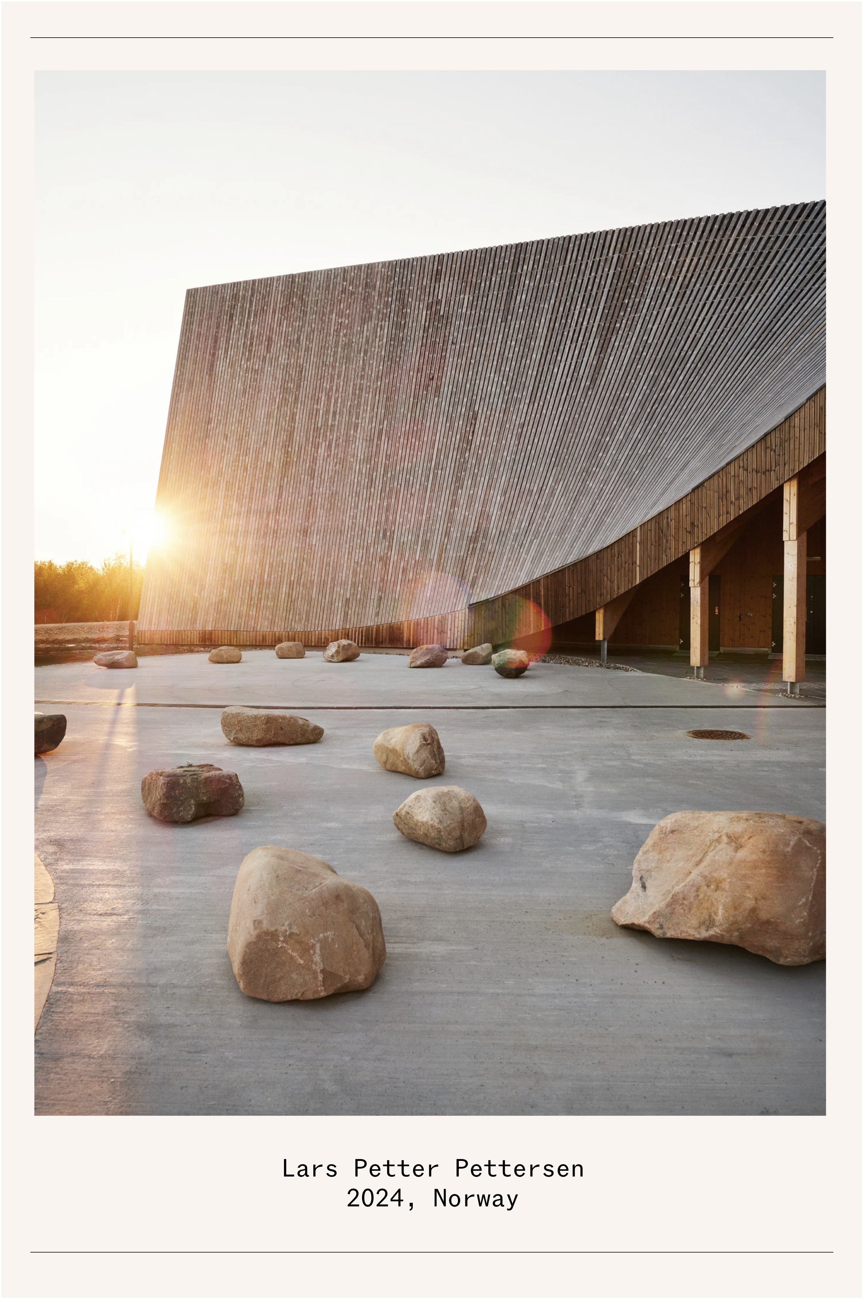
Shooting architecture in the Norwegian summer requires working long hours - it’s light most of the day. However, the extended period provides a unique opportunity to observe a building in nature’s best mode. “The so-called magic hour is more like several hours,” explains Oslo-based photographer Lars Petter Petersen of his recent shoot fof the Čoarvemátta Cultural and Educational Hub on Finnmarksvidda, Norway's largest and northernmost plateau. The striking timber Sami school and theatre designed by Snøhetta, together with 70°N architecture and artist Joar Nango, features an incredible sloping roof and an interior ceiling that pays homage to the Sami tipi. Petersen says the flat terrain the building sits on made it hard to capture its majesty, but the magical summer light certainly helped. “My photos aren’t ‘staged’ I try only to use natural light and I enjoy visiting a site without too much of a brief, so I can really learn about the place on the site itself.”
One would imagine shooting in the winter in Norway is less magical - not the case says Petersen. “Sure, you have only a few hours of daylight, but you have the snow in the winter, which gives off this blueish amazing glow - it’s not pitch dark either, it’s dusky for a long time - and a beautiful time of the year to shoot.”
Lovely thanks Nolan x