

Design Considered #12
Steamy diplomacy, decent digital design, and many beautifully printed books.

#01 - Opening Thought
The Finns are becoming increasingly famed for applying Sauna diplomacy into their geopolitical agenda, easing the clothes off politicians and business titans to help form a level playing field for discussion within steamy timber-walled surroundings. The Nordic nation’s Helsinki Design Week (which runs until Sunday) is also gaining global recognition for providing a deeper dialogue on our industry and its responsibilities than many of the more financially focused trade events that pop up around this time of year.
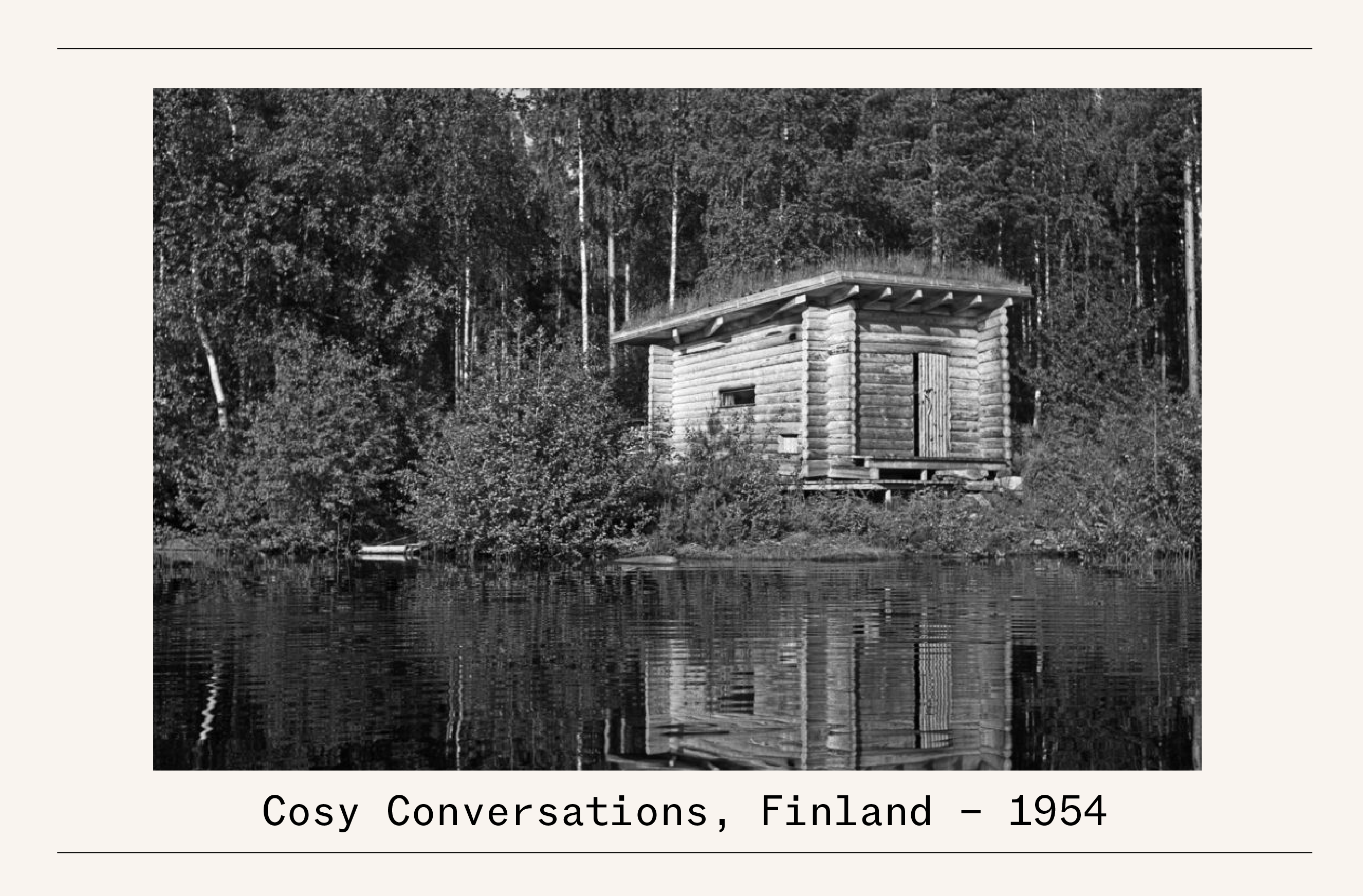
In the Finnish capital, a novel approach to stimulating international debate (this time with clothes on) comes via its Design Diplomacy series, which is taking place in the refined setting of many of Helsinki’s consulate buildings. Each event pairs a Finnish designer with an international counterpart from said embassy’s country for engaging and wide-reaching public discussions. We imagine the nation’s greatest design export - late master modernist maestro Alvar Aalto (whose cosy sauna at his Muuratsalo Experimental house is pictured above) - would approve.
#02 - Digital Design
My struggles with design storytelling on social media (part of the reason I launched this newsletter) continue. Having cut my communications teeth producing print magazines where both journalism and advertising are given space and room to breathe (and messaging enabled to unfold artfully), trying to apply these same principles into a media form where milliseconds of attention matter so much rarely generates meaningful results. With this in mind, I’m seeking advice wherever I can receive it. Hence my call earlier this week with one of my favourite graphic design and art direction studios, Melbourne’s Studio Hi Ho, to discuss the matter.
True masters of designing for traditional mediums like high-end print collateral for Australia’s top property developers and signage for the city’s most interesting hospitality spots, the studio is increasingly celebrated for its digital work. It was the practice’s work for A3 music and arts festival that prompted the call. Developed alongside Peter Deering, an Aussie, LA-based designer, the digital material and social media assets deliver music and motion, colour and energy, impact and credibility, all in a tasteful and easy-to-appreciate manner. It’s the perfect recipe for social media success, but a craft that’s hard to master for marketeers.

Here are a few learnings from the conversation:
Work with a client who “gets it”. “A3 pushed for motion that would grab people’s attention in milliseconds,” says Studio Hi Ho graphic designer and art director Cam Norris. However, the social-savvy client allowed much time for trialing, testing, and development and provided a meaningful feedback loop.
Accept who is the boss. “It comes down to the algorithm,” explains Studio Hi Ho co-founder Patrick Scanlan. “Some posts on our studio’s social media have tanked because they didn’t suit the algorithm, despite us knowing it is good work. Instagram likes a lot of motion and movement, the ‘slot-machine’ effect, which isn’t appropriate for all brands,” he adds. This makes social media marketing a challenge for quiet and more reserved companies - who don’t tend to ‘shout’ for attention.
Be economical with your content. “You can spend a lot of money shooting an architecture project, and people will still zip past it,” adds Scanlan. Clients should invest wisely in social media frames, templates, and motion that can be used multiple times in different storytelling situations.
Design work relayed on the small screen should always stand up to the quality of the product or project it is pushing. In the case of Studio Hi Ho’s approach to design for the platform, there’s no compromise on quality despite the medium. “In the case of A3 festival, these guys have done a lot of work in truly understanding what the festival will be like and will feel like,” says Scanlan. “Interpreting this through design drives the colour, the typography, the motion, and narrative. The idea should always be that when someone buys the ticket and arrives at the festival, the event reflects the whole concept they’ve bought into.”
#03 - Design Selection

I never thought I’d see the day when reading physical books would be classified as a ‘trend,’ but here we are in 2024. I guess books being back en vogue with the youth is a good timing for me - as a title I worked on as editor in chief, (1) ‘The Book of Birkenstock,’ (published by Steidl & designed by Bureau Borsche), which lays out an impressive 250-year visual history of shoemaking and sandal-wearing, is currently enjoying a global launch with recent events in London and New York. Continuing with big, bold books, (2) ‘Paula Scher: Works,’ co-edited by Tony Brook and Adrian Shaughnessy, chronicles 300 of the Pentagram partner’s most influential projects, thoughtfully arranged in thematic sections.
With well-drawn cover art from Julien Posture, next week’s edition of the (3) ‘The New York Review of Books’ is full of fine recommendations of reads for the colder months ahead. More in design - one of Europe’s more progressive creative publishers, Mendo, from The Netherlands, is back in business after a tough 2023. This is refreshing news as it publishes one of the best design books of the past year, a homage to the colourful new guard of Dutch creative talent (4) ‘The New Stijl’ A print gem in a more lite, limited form comes from the creative team behind French running brand Satisfy’s ‘Possessed’ digital branded content channel. They’ve opted the digital product for the off-set press through (5) ‘Possessed Magazine.’
#04 - For Your Consideration

A lush visual treat to kick off this week’s Design Destinations comes via the tasteful colour choices and cerebral image treatment from New York-based Graphic Services branding work around Phillip Lim’s Sunday show at the Big Apple’s Fashion Week.
London Design Festival (LDF), which kicks off next week, also looks to the US, with Studiomama co-founder Nina Tolstrups’ ‘Pavilions of Wonder’ installation that “fuses the vibrant essence of the Barbie DreamHouse with Greater Palm Springs' iconic midcentury modernism” - let’s hope the weather in the English capital is equally sunny.
While LDF is rich with quality showcases, in years past, the event has been notoriously tricky to navigate. To enjoy the occasion best, design editor Amy Frearson has kindly constructed a handy Google Maps-based guide to the event. Having helped Salone del Mobile attendees with a similar effort, I’m sure this edition will also be a winner.
Paris Design Week is wrapping up on Saturday. However, there’s still a tiny window to drop by Muji’s mini house in the Marais, highlighting how low-impact living can be done in style via a collaboration with strategic place-makers 5.5 Studio.
For digital insight into decreasing your carbon footprint, US media title Atmos has put together a series of 101s on tips to save the planet, from what to eat to how to best electrify your home, all aided with lush imagery and fact-packed journalism.
#05 - Through The Lens

While the work of Portuguese photographer Matilde Viegas often highlights the coastal nation’s verdant landscapes and characterful cityscapes, sometimes she finds herself in tougher-to-shoot spots. For a recent feature in in the town of Beringel, she spent the day with master potter António Mestre, whose whole studio set-up has been tailored toward enabling the craft of creating gigantic wine amphorae. A functional space for work, but not massively photogenic. “I always try to see the situation through the eyes of the person I’m speaking to” says Viegas. “I question the subject, find out what makes the environment special to them and learn about their process. This empowers me to show the craft from their perspective but in the best light.” Based in the city of Porto, Viegas says she’s pleased that the recognition of the myriad artisans and craftspeople of the country is growing with foreigners. She aims to continue photographing this talent in a manner that is “more elevated and cherished - showing there’s a real need for this type of work.”