

Design Considered #36
Place versus taste, good design industry reads, and a lovely lamp from Spain...

#01 - Opening Thought
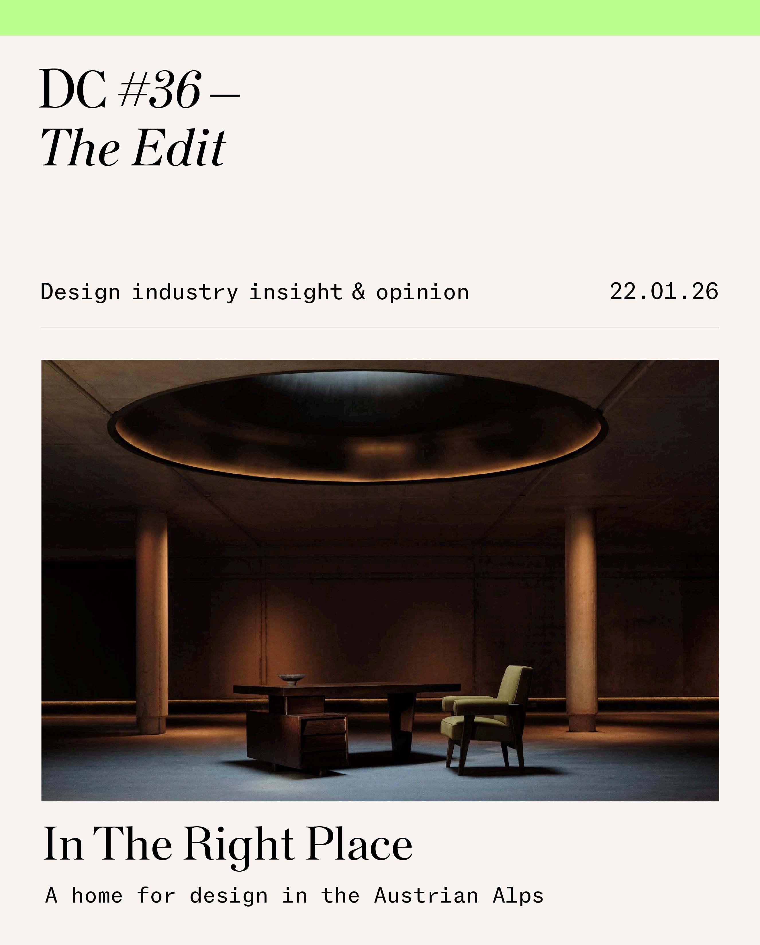
“The reason to travel is to find a world that you don’t know,” explains Gerold Schneider. Along with his wife, architect Katia Schneider, he owns and operates Hotel Almhof Schneider in Lech and a constellation of other thoughtful projects in this snowy corner of the Austrian Alps. His statement, strangely, doesn’t compute with the luxury travel sector these days – where design feels ubiquitous, and a sense of place is replaced by engineered, cut-and-paste ‘good taste’. Pull up at Almhof Schneider, however, and you’ll certainly step into a world you’ve never experienced before. The first port of call is the concrete-and-polished-asphalt car park, created by the Schneiders in collaboration with Japan’s Shinichiro Ogata. It’s where the above image (taken by Jake Curtis for the Provenance exhibition by Rajan Bijlani) was made under the space’s perfectly proportioned circular skylight. It’s hardly traditional Alpine construction, but like the rest of the design here, it resonates naturally with its surroundings.
“The most common word we hear from those who describe this place is ‘home’,” says Schneider, who emphasises that more people are coming round to an appreciation for places that don’t try to “control the experience”. “The tendency in modern society is to control rather than accept things as they are,” he adds, describing the shifting mindset Almhof Schneider embodies as one that’s closer to simply letting things be and appreciating quality without pretense. Through this philosophy, design from around the world finds an easy home here. When London-based collector Rajan Bijlani visited, he insisted the Provenance exhibition’s Le Corbusier and Lucie Rie pieces be displayed openly in the hotel’s public spaces. Schneider’s hesitation was practical: “I said, do you realise people will throw their wet jackets over these very expensive pieces?” But that’s precisely the point. Museum logic gives way to something better here – the chance to live with real beauty.
Provenance is a collaborative exhibition presented by Rajan Bijlani at Hotel Almhof Schneider in Lech, Austria, bringing together works by Frank Auerbach, Lucie Rie, Le Corbusier, and Pierre Jeanneret. It runs until 6 April 2026.
#02 - For Your Consideration

While slashed budgets mean many mainstream design media outlets have evolved into recyclers of press materials, international dailies are picking up the slack and delivering insightful industry reporting. This New York Times deep dive into rebooting the midcentury design intellectual-property economy featuring Form Portfolios is top-shelf reporting that highlights how legacy design can be commercialised without being cheapened.
The Financial Times also presents some of the strongest industry insight and criticism spanning furniture manufacturing, architecture, design, and interiors. Edwin Heathcote’s beautifully crafted architectural review of SANAA’s new museum in Taichung argues for civic generosity over spectacle. A Big Read on Trump’s furniture tariffs punctures reshoring rhetoric with inflation and frozen demand. And a clever (and lush to look at) interiors feature on social-media-friendly kitchens unpacks how fridges, joinery, and patina now function as cultural capital online.
I’m certainly not down on the quality of design reporting as a whole; you just have to know where to look to find the good stuff. Oxford Talks recently hosted a podcast conversation with legendary Pentagram partners Michael Bierut and Harry Pearce that cuts through creative folklore and focuses on how good studios survive. Bierut says that long-term success comes from caring about invoicing, taxes, and operations as much as the work itself, while Pearce outlines how Pentagram’s unique structure — autonomous studios, profit splits, and no hierarchy between partners — is held together by trust, discipline, and collective responsibility.
For more quick-to-consume content on good graphic design, you can jump on Instagram to view Loan Bottex’s new identity for Notes de Bas de Page, a Parisian niche perfume house. A bespoke serif logotype, rooted in French typographic history and defined by enlarged capitals and oldstyle figures, gives the brand clarity and cultural confidence without leaning on cliché. One should also sneak a peek at London-based A Practice for Everyday Life’s visual identity for the 12th SITE Santa Fe International, a calm, coherent system deployed across campaigns, publications, and exhibition design, with a tasteful use of a poppy blue that adds lift without distraction.
Now, enough screen time. There’s much on the agenda in the real world, with plenty of European trade events worth pencil-marking in the diary. Stockholm Creative Edition (3–7 February 2026) brings a focused, tasteful design week to the Swedish capital. Collect at Somerset House, London (27 February–1 March 2026; previews 25–26 February) follows, with TF Chan, the talented new director, setting the global craft agenda with a sophisticated curation of global galleries. Matter & Shape Paris (6–9 March 2026) rounds things out nicely in the Jardin des Tuileries, continuing its cross-disciplinary mix of architecture, furniture, and objects, and bringing us (hopefully) into sunny Spring. I’ll be making my way round the lot, so if you’re around, do say hi.
#03 - Design Selection
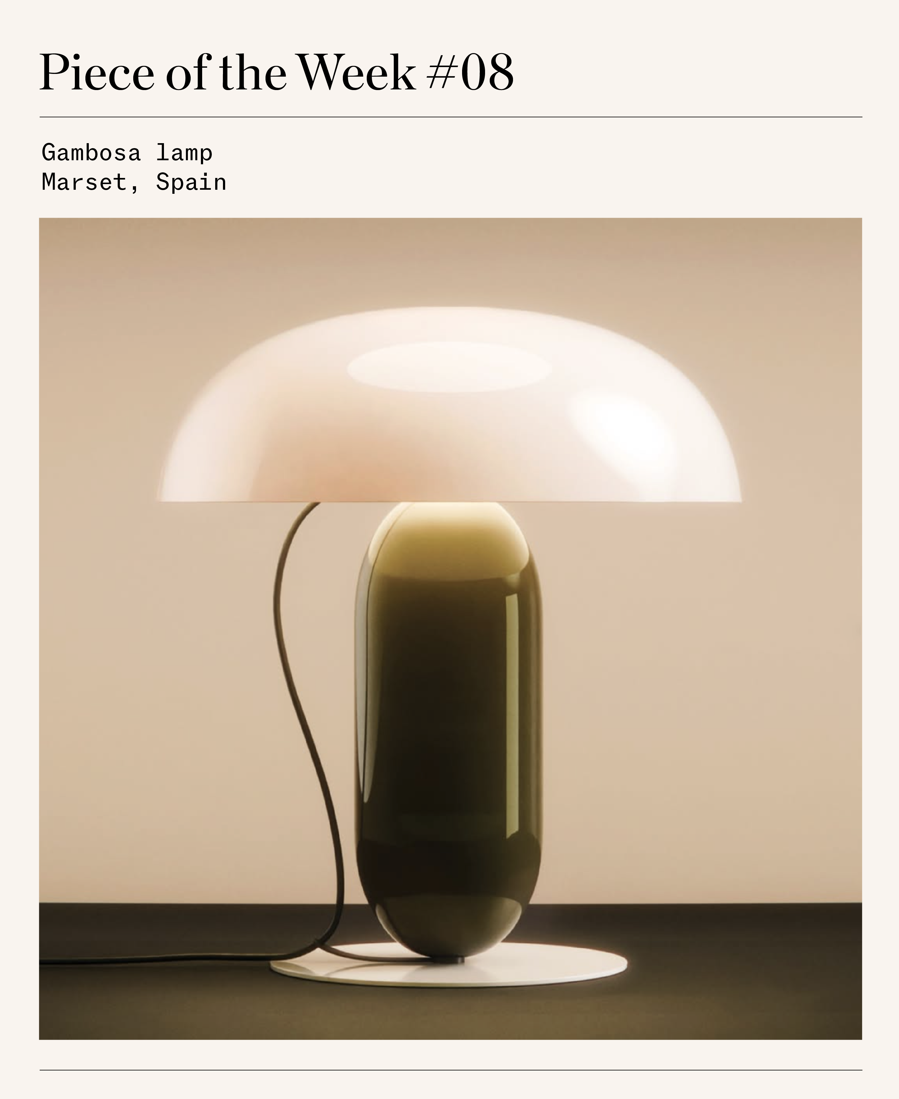
Released last year and designed by German-born, London-based Mathias Hahn for Spanish masters of lighting Marset, Gambosa is lamp-craft at its loveliest. With a focus on appealing proportions and the considered use of coloured steel, alongside a translucent shade option, this indoor lamp is measured and composed.
Deceptively simple in form, it is built from three clearly defined elements: a circular base, a slender vertical stem, and an offset curved shade. Its clean lines guide the eye gracefully across the object and establish a sense of equilibrium between parts. Hahn’s expertise in industrial design is evident in the lamp’s clarity. Lines are precise, volumes are easy to enjoy, and the relationship between solid form and open space is carefully considered. Whether on or off, Gambosa maintains a strong visual presence in any room.
Also including a beyond the paywall link for The New York Times story on Form:
https://www.dropbox.com/scl/fi/qmn0bmlmpb9nbwh1hugsa/FORM-The-New-York-Times-Can-You-Reboot-a-Lamp.pdf?rlkey=ulgguc7221xhgq24016fvua0w&e=3&dl=0
@Nolan Giles - Thx for the shout out for the NYT story on Form Portfolios - agree on the sharp reporting 🙌🏼